Did you know that design is a super important tool to ensure a pleasant experience for users on your website? In fact, good design is essential for improving UX (User Experience) on any digital platform.
And with the Hand Talk Plugin, it could not be different, right? So, stick around as we tell you more about our accessibility plugin and how it can be a powerful ally in making your audience’s experience even better!
What is the Hand Talk Plugin?
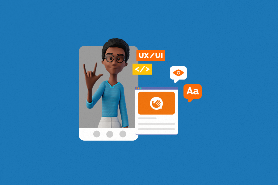
The Hand Talk Plugin is our accessibility plugin for websites. It was born as a tool for translating Portuguese into Brazilian Sign Language (Libras), focusing on promoting digital accessibility for the deaf community. Nowadays, after extensive research and new updates, it is also available for translations from English to American Sign Language (ASL), along with other assistive features that reach an even broader audience!
To give you a better understanding, the Hand Talk Plugin works based on Artificial Intelligence and relies on two super friendly 3D virtual translators, Hugo and Maya, to perform all translations from written language to Sign Language. It is essential to make web information accessible to deaf individuals who often do not master the written languages of their countries.
Oh, and there is more! In order to make online portals more accessible to an even larger audience, our accessibility plugin also includes 4 complementary assistive features: reading mode, website reader, line spacing adjustment, and font size adjustment. These new functions aim to help people with dyslexia, low vision, ADHD, dementia, dyscalculia, aphasia, the elderly, and others with visual disabilities and difficulties in reading texts in general. Pretty cool, is it not?
Understand Hand Talk’s commitment to accessibility
Here at Hand Talk, we live and breathe accessibility. In fact, our purpose is to break down the communication barrier between deaf and hearing individuals through technology.
We want an increasingly larger audience to be able to navigate the digital universe with independence, autonomy, and equity. We work to make the web a more accessible space for everyone, especially in a scenario where only 3% of American websites are accessible to people with disabilities.
Our goal is also to make corporations understand that investing in digital accessibility is not an act of philanthropy. In this context, a website that is accessible leaves 97% of the web in America behind, standing out as an organization prepared to welcome any type of consumer. Consequently, this presents a significant market opportunity, does it not?
How was the Hand Talk Plugin design chosen?
First and foremost, we based ourselves on good design practices to develop the Hand Talk Plugin. Up to this point, there are not many surprises, but it is important to note that, for the creation of any digital product, considering good design practices is essential to start building a good user experience.
Now, speaking more specifically about our accessibility plugin, we also had in mind that we wanted a neutral appearance, so as not to conflict with the visual identity of our clients. In addition to this more global appearance, our main focus was on accessibility. That is, ensuring the presence of color contrast, having clickable elements and our texts in good sizes, and making sure that the plugin could be well navigated by screen readers.
Want to know even more details? Let’s go! Regarding the function of the Sign Language translator, we chose a design where the window size was ideal for the user to navigate the site with the plugin open simultaneously, without one content obstructing the other.
This was the same reasoning we followed when launching the additional assistive features. Especially when opening them on a mobile device, it is very important that the window with these add-ons is neither too large, preventing the user from seeing the impacts of each selected feature on the website’s visualization, nor too small, making it difficult to understand what they are clicking on.
How does the plugin’s design contribute to the user’s experience?
Well, before getting into that, we need to make an important observation: even if a website follows all accessibility requirements and guidelines, often that is still not enough for a large portion of users.
Hold on, let us explain. The idea behind this statement is that, even if the website is accessible in code and content, users often want or need to make small adjustments to it, to facilitate their reading and understanding of information.
This is how the Hand Talk Plugin contributes to the user experience of those accessing your portal. Our role is to serve as an accessibility complement to websites, providing different alternatives for people to adapt their viewing and understanding of content in a way that works better for them.
What is the importance of keeping the original configuration of the Hand Talk Plugin?
Out of sight, out of mind, right? This saying also applies to the Hand Talk Plugin. What we mean by this is that it is not enough to add our accessibility plugin to the website but hide it in some hard-to-find corner.
Therefore, maintaining the original configuration of the plugin, keeping its button on the website’s sidebar, is super important so that users can find it and use it. This benefits both the audience, which will now have an easier time accessing the necessary accessibility features, and your own site, which will be more prepared to welcome people with different needs.
“Oh, but then I cannot change the button’s color?” Yes, you can! You can make some customization choices for your Hand Talk Plugin and deviate a little from the original configuration, such as changing the color of the button from blue to dark gray or light blue!
3 tips for using the Hand Talk Plugin in the best way possible!
In general, using the Hand Talk Plugin is quite easy and intuitive, but there are some best practices that can make the experience with it even better! And remember: you can always talk to our support team to understand how our accessibility plugin can work better in your specific context.
Tip 1 – Always keep the Hand Talk Plugin button visible
As mentioned earlier, it is essential to keep the button in its original configuration on the website’s sidebar. If it is only available within an accessibility-focused page or in the form of a small link in the footer, users will not be able to find it easily.
Tip 2 – Talk to our support team
Our support team is available to assist you with any questions, difficulties, or problems you may face with the use of the Hand Talk Plugin. Moreover, they can also help you find the best place on your website to put the plugin button! This way, attracting more users to use it.
To get in touch, just send an email to [email protected].
Tip 3 – Follow best practices when building your code structure
Having a good code structure is super important for the Hand Talk Plugin to function in the best possible way. So, make sure your website is following industry best practices.
For example, avoid having very long blocks of text. Besides making it difficult for users to read, our accessibility plugin does not work on text blocks with more than 1,000 characters.
Conclusion
So, did you enjoy learning more about the design of the Hand Talk Plugin and how it is a great ally for a good UX? To delve even deeper into it and all its features, talk to Hand Talk’s experts! This way, we can together build a more accessible web and promote a good experience for all users.